An advocacy organization wants to organize transit riders in the most transit-poor neighborhoods. It will create briefs for each community area on the level of transit service and its relationship to job access and transportation costs.
In this example, the Englewood neighborhood of Chicago is compared to the city of Chicago. The neighborhood has a high percentage of low-income and zero vehicle households. Although the neighborhood is served by high frequency transit, the data shows that it does not offer adequate connections to job centers.
![]()
![]()
The Chapel Hill/Carrboro Chamber of Commerce wants to write a summary of how transit service supports its members in Chapel Hill and is looking for data points on workforce and customer reach.
• Customer HHs accessible in 30 minute transit trip – 22,378 Households
• Workers accessible in 30 minute transit trip – Of the 26,512 workers accessible within a 30 minute transit commute, 50 percent (13,051) have Some College or Associate’s Degree.
• Jobs near transit – Eighty one percent of the jobs in Chapel Hill are within ½ mile of transit.
• Walkable neighborhoods – The average size of a block group is 23.9 acres. Smaller block sizes, ideally 2 to 5 acres, promote walking. Increased foot traffic for retail establishments can lead to higher sales.
• Transit Performance Score – 5.1 (A 0-10 score that measures access to land area and jobs, connectivity and frequency of service).
• Transit Access Shed – The optimal distance that can be reached in a 30 minute transit trip is 22 square miles. Larger sheds indicate access to larger market share.
• Transit trips per week – Chapel Hill is served by 1,805 trips transit trips per week. A majority of these trips are on weekdays and thirty five percent of the trips are during rush hour (Mon-Fri, 7-9am/4-6pm).
An elected official gets grilled about transportation, so she asks her staff how transit access in her district compares to other districts in the city. What parts of the district are deficient, and what types of constituents (how many, what income/race) are affected by this deficiency?
Tottenville/Great Kills, the Southern-most community district in Staten Island is very poorly served by transit in an otherwise transit rich city. It is important to note that although transit is available in to all parts of the community district, 40% of the district is not served by high frequency transit (service every 15 minutes or less). Equitable access is diminished due to fewer jobs accessible by transit, higher transportation costs, and less mobility options compared to other districts.
A specific example of a transit-deficient neighborhood is a majority owner-occupied block group (Block Group: 360850208031) which has access to only 3% of the jobs accessible in a 30 minute transit trip compared to the average block in NYC (36,940 compared to 1,346,702).
• Transit Performance Score –8.1 (versus 8.8 for Staten Island and 9.6 for New York City)
• Households near transit
• Commuters near transit – Eighteen percent of the 853 commuters who live within ½ mile of transit use public transportation for commute, compared to 30% & 59% of commuters in the county and city respectively.
• Transportation cost – The regional typical household would pay 16.3% (compared to 8.8% for the city) of their income towards transportation costs in this block group. This can be attributed to the poor transit connectivity requiring them to own cars to get to work and for other trips.
• Transit Connectivity Index – 23 (versus 25 for Staten Island and 46 for New York City)
• High Frequency Transit – The block group has no access to high frequency transit routes within a ½ mile. In comparison, the average block group in Staten Island and New York City has access to 4 and 16 high frequency transit routes within a ½ mile.
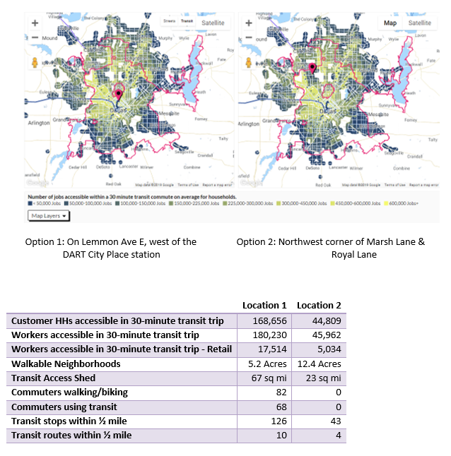
A local entrepreneur wants to find a site for his/her business, one that is close to transit, customers, employees, and business partners. What are some viable site options?
Locations easily accessible by all modes of transportation and that provide transit options for employees are ideal for the business, especially in the retail sector.
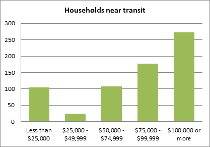
The mayor has announced a new affordable housing agenda. A neighborhood group wants to show the mayor that the housing plan needs to be accompanied by improved transit service. They want to use AllTransit to find out how many people already live in the area and transit availability.
• Population near transit
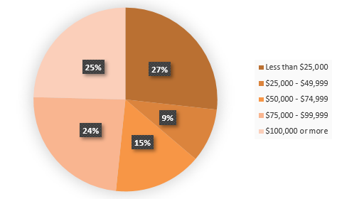
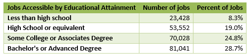
By Race: While transit is accessible to nearly 95% of city residents, only 51% (222,460) of the people in Atlanta live within half a mile of high frequency transit (rush hours only). The racial mix of these people is: 52.4% African-Americans, 34.7% White, 4.8% Hispanics & Latinos, and 8.1% of all other races.
By Educational Attainment (living within ½ mile of transit):
• Households near transit – 183,461 (95.5%) households live within ½ mile of transit, out of which only half (94,076 households) live near routes with 15 minutes or less headways during rush hour.

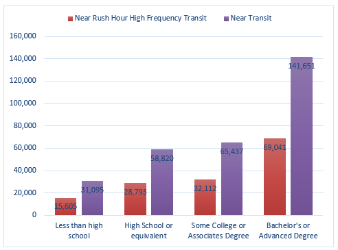
• Jobs accessible in 30 minutes – 27% of the jobs accessible in a 30 minute transit ride require a high school degree or less
• Transit trips per week – 3,891 (793 peak hour trips, 424 evening trips and 86 night trips)
• Low Income Housing Tax Credit units near transit
• Transportation Cost – 18.9% of an average household’s income is spent on transportation (CNT’s H+T Index’s measure of affordability recommends that transportation cost be no more than 15% of household income)
A city resident believes that transit service in his/her community is not as good as another community, nor as connected to alternative transportation options such as car and bike share. How can AllTransit be used to investigate this claim?
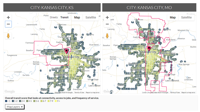
• Transit Performance Score – 3.6 for Kansas City, KS compared to 4.8 for Kansas City, MO
• Transit Stations – The average neighborhood in Kansas City, KS has access to 33 transit stops within a half a mile compared to 44 in Kansas City, MO.
• Jobs accessible in a 30 minute transit commute – On average, neighborhoods in Kansas City, KS have access to 65,210 jobs in a 30-minute transit commute, compared to 109,272 for Kansas City, MO.
• Transit Shed – On average, Kansas City, KS households have access to 16 square miles and the destinations within them in a 30-minute transit ride, compared to 29 square miles for Kansas City, MO households.
• Transportation Cost – The typical regional household in Kansas City, KS pays 0.7% more of annual income towards household transportation costs (20.9% versus 20.2%).
• Bike & Carshare – There are currently no bike and car share locations within a half mile of transit in Kansas City, KS, compared to five car share locations and 38 bike share locations near transit in Kansas City, MO.
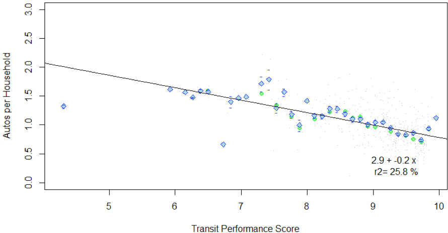
A researcher seeks to study the correlation of Transit Performance Score and Autos per Household in Hudson County, New Jersey. The hypothesis is that households will own fewer cars in areas with high transit performance scores and vice versa.
Analyzing the correlation of the Transit Performance Score and ACS Autos per Household for all block groups in Hudson County, NJ indicates a high negative correlation between the two variables. As the AllTransit Performance Score for a block group increases, the number of autos per household decreases. This indicates a preference for low auto ownership when transit availability is high and frequent, and provides connections to many jobs in the region, resulting in high rates of journey to work by transit.
A district public health representative (neighborhood-based) is seeking information to identify neighborhoods where residents can rely on well-connected transportation options – transit, walking, and biking- and reduce their reliance on autos.
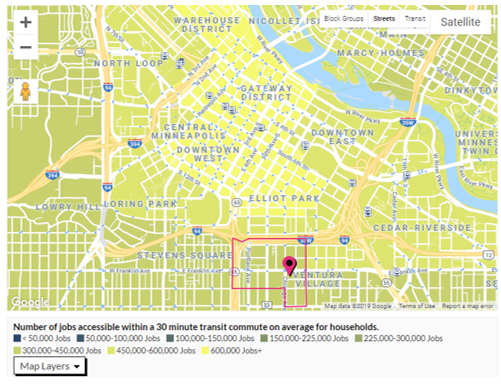
Residents of the Ventura Village neighborhood in Minneapolis (Census tract 27053005902) have access to 30 routes, three of them full-day high frequency, within a half mile. The Transit Performance Score for the neighborhood is 9.3, indicating a high level of transit that can support less reliance on automobiles.
• Walkable Neighborhoods – The average size of a block group in this neighborhood is 4.6 acres. Blocks 2-5 acres support a pedestrian friendly neighborhood.
• Farmers Markets – There are zero farmers markets in the tract, but 31 are available within a 30-minute transit ride.
• Commute by Bike – 5.4% of the commuters residing in this neighborhood bike to work.
• Commute by Walking – 6% of the commuters in the neighborhood walk to work.
• Commute by Transit – 33% of the commuters in this neighborhood take transit to work.
• Carshare – There are no carshare vehicle within a half mile of transit in this tract.
• Bikeshare – There are five bikeshare vehicle within a half mile of transit in this tract.
New York City has one of the best transit networks in the country, but some parts of the city do not enjoy high quality transit access. Which parts of the city have less connectivity and who lives there?
Queens has the highest percent (44.3%) of non-English speaking households among the five boroughs of New York City. Brooklyn (32.6%) is next, followed by Bronx (28.7%), Manhattan (25.1%) and Staten Island (16.4%). Non-English speaking households are largely made of immigrant families and have less access to options for upward mobility.
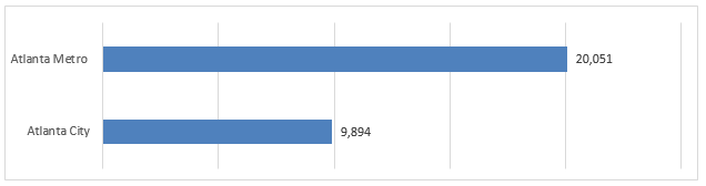
The graph below compares the number of jobs accessible in a 30 minute transit commute from the different community districts in the borough of Queens. Access to jobs from Queens Village and Flushing are much lower than Astoria and Forest Hills.
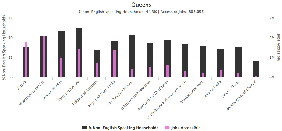
While Manhattan has the most jobs accessible by transit, Washington Heights and Morningside Heights community districts have a high percent of non-English households and the lowest number of jobs accessible. In Brooklyn, community districts with less job access are Bensonhurst, Coney Island and Flatlands. Morris Park and Williamsbridge community districts in Bronx, with over 30% non-English speaking households, have access to 484,554 and 289,122 jobs respectively (compared to Bronx’s average of 809,791).